
![]()
![]()
View testimonials and read about our happy clients!
See how people have used their logos for letterheads, brochures and more!
![]()
Contact us with questions or to make payment arrangements
Leaving the site without ordering a logo? Please read this first!
Don't leave yet! Perhaps win a free logo!
We recognize that we may not be the perfect fit for every person or company seeking a logo. We'd also like to understand why people leave our site without selecting us to do their work.
If you need a logo and have decided not to work with us, won't you please send us an email and let us know why? Every week we will randomly pull one email from these responses, and that person or company will receive a free web logo design. This can be a logo for your company, a graphic for your website, or something similar. We will not add you to a mailing list, and we will not sell your email or contact information. We will only reply to the email if it's appropriate or if you request it. Please feel free to read our privacy policy. Even though we are marketers, we hate getting spam and we don't spam anyone--ever. This information will simply be used in aggregate to help us understand more about our market.
Some sample reasons may be:
- - I don't like your logo designs.
- - I don't think that they could be quality designs for $99.
- - I wasn't really looking for a logo. I just found your site by mistake.
- - I'm only in the vendor research stage and am not ready to purchase yet.
- - I've selected you as my vendor, but I'm not ready to buy yet.
- - I want more flexibility in the service.
- - I need personal consultation, not a web-based service.
(If your reason is similar to the last two, please contact us before making your final selection. We do offer more flexible and constulative-oriented services through other divisions of our company.)
Whatever the reason, we'd appreciate knowing it. Don't worry. We won't take your feedback personally. We just want and need to know so that we can make our service a better one.
Thank you!
There's a difference!
Selecting your logo is an important part of marketing your company. If you are thinking of leaving this site without placing an order, please take a moment to print off and/or read this page prior to placing an order with any vendor.
On this page you will find:
Section 1: Web graphics versus graphics for quick printing and commercial printing.
Section 2: Why predesigned logos are not something that you want to buy.
Section 3: Information on what to expect from participating in bidding portals.
Section 1: Web graphics versus graphics for quick printing and commercial printing:
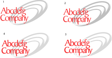
Can you tell the difference between these logos?
Don't worry. Most people cannot.
Yet, technically, each of these logos is different even though they appear almost the same.
If you are only going to use your logo on the web, then other inexpensive ($99, $69, $49, $25) logo services may be the right choice for you. But... only $99DollarLogos.com gives you commercial grade logos for the price of a web graphic.
If you think that you will ever want the logo printed by a quick-printer onto business cards or a flyer, or if you are going to want to print a quality brochure some time in the future, you need to know that web graphics aren't technically constructed for these purposes.
Clockwise from the top, left, these logos are constructed as follows:
#1 is a logo created for the only for the web and is what most $25, $69, $159 and other $99 logo companies generate. It is constructed to be output in *.gif, *.png or *.jpg only, and the colors are done in RGB. (RGB are combinations of Red, Green and Blue that computer monitors and televisions use to generate colors on the screen.)
#2 is a logo created for high-end 2-color printing. It is architected to be printed in 2 custom solid PMS inks--specifically 185C and 427C. (PMS inks are the solid-colored inks used by commerical printers.) PMS inks are used whenever the customer wants rich color without the expense of printing in full color. PMS inks can also be printed on top of full-color print jobs whenever you need a solid, strong color or coverage.
This file is constructed to "trap" the red and black inks (meaning that they actually overlap each other very carefully without over-printing on top of one another) and is architected for what is called "tight registration."
#3 is a logo created for quick-printing in 2-color. It is architected to be printed in more "common" PMS inks--specifically Pantone Red 032 and Pantone 420C, and there is a white line around the red letters. Why? Because most quick printers run smaller, less expensive presses that cannot register the logo tightly. They cannot guarantee that the letters will butt up tightly against the swirls in exactly the right position, so you have to create a logo that has a buffer area where it's ok if the two colors don't line up exactly. We're sure at some point in your life you've seen an example of something that was printed with one of the colors out of alignment. Our goal is to create a logo where slight differences in alignment will not detract from your design.
#4 is a logo created in 4-color process, or what's known as CMYK. (CMYK stands for Cyan Magenta Yellow and Black). (It has been converted to RBG for display on your computer screen.) CMYK is the combination of inks that designers and printers use to create magazines, full-color brochures, calendars, etc. Ink companies publish directories (called SWOP books--which designers pay for) full of swatches of colors, and tell the designer what combination (in percentages) of Cyan, Magenta, Yellow and Black will create the desired color.
CMYK uses dots of colors, layered on top of one another, to create the illusion of another color. Look at the Sunday comics up close or with a magnifying glass. You'll see tiny dots of the colors Cyan Magenta Yellow and Black. Hold it back, and the inks blend together to make different colors. Magazines, brochures, etc. are done the same way, but with much smaller dots (technically called "line screen").
Here's the problem. Uneducated designers may create a logo that looks great on the screen, and they may even know how to tell the program that they want the design to be generated in CMYK ... but, just because it looks good on the screen, doesn't mean that it meets the technical/production requirements of a good CMYK color combination. Just ask any printer.
First, the computer screen cannot replicate a CMYK combination with any degree of accuracy. (In fact, the same file will most likely look different on your screen versus ours versus your neighbor's.) Second, there are "mud colors" (also called "out of gamut" or "out of range") that are the unfortunate result of using only a computer to pick your CMYK combination. They may look fine on the screen, but when the printer goes to print the art, it turns muddy (dull, or off a bit) because the ink did not follow the formulas published by the ink companies (usually Pantone®). It's kind of like baking a cake without a recipe, and putting in too much baking soda and too little sugar -- it appears OK during the mixing process, but when you sample the finished result, it's not what it should be.
If you are fortunate enough to find a logo designer that can take all of this into consideration and still deliver a multi-purpose logo for $25, that's an incredible bargain. Assuming you like his/her design work, we'd say "Go for it." and we'd like to know who this person is because we'd like to hire him/her. :-)
If you ask them about trapping, registration, CMYK SWOP books, etc and they don't understand what you are talking about, we strongly recommend that you consider some of the formally-trained and/or experienced desktop artists out there that can ensure that your logo will serve your purposes, now, and in the future.
---------------------
Section 2: Why predesigned logos are not something that you want to buy.
Please, whatever you do, don't get a logo that looks like this:
or this...
or this...
(These aren't horrible for the 10 minutes it took to create them,
but they really don't represent anything specific, do they? )Predesigned logos sound like a bargain. They look OK, they are very inexpensive, they are easy to order, and you can usually get them in only one or two days.... but, if you get a predesigned logo, (also known as a "chop shop" logo) you are missing the entire point about having a logo in the first place. You might as well have your quick printer use clip art. Logos aren't just to make your collateral look pretty. Your logo is supposed to be your brand identity. You want something that is distinctive, not something that 50 other companies just like you are using.
Close your eyes and picture the Coca-Cola logo®, the Ford® logo... Google™... AOL®.... These are distinctive logo identities. You want a distinctive logo for your company as well, don't you?
---------------------
Section 3: Bidding portals
Bidding portals such as Elance are a great idea in many respects. They are a virtual meeting place for vendors and customers to establish contact. Designers get to show you their portfolios and feedback, and they can submit a quote to you. You get to look at multiple designer portfolios all on one website without having to search all over the web.
We belong to two of the largest design bidding portals. They definitely have their place. However, if you haven't used a bidding portal before and are thinking of using them, please make sure that you are aware of the process and can devote the time and energy into making it work.
Here is the process if you are going to look at portfolios (which most clients want to do):
Go to the bidding portal and select the type of service you desire.
You will be presented, usually, with 5 - 10 randomly-selected vendors. You may then click on their profiles and read them, then click to load their portfolios if they are of interest to you.
You will probably want to view more, since only a few of the first 5 - 10 will seem like a possible match.
Then after you have looked at enough of them, you will want to create a "short list" of perhaps 10-15 vendors that you wish to invite to bid on your project.
In order to make contact with them, you will need to post your project. That means that you have to register if you haven't already. If you have registered, you can simply log in.
Then you need to detail your project and provide enough information for the vendor to supply a quote.
Next, you wait.
Vendors that you invite or that pay more for their portal memberships sometimes get 'first dibs' on your project, or it may be open to everyone. It depends on the portal what level of control is available to you. Depending on the structure, and depending on the detail level of the quotes from the vendors, you may begin receiving bids in only a few hours. Sometimes they are flat fee, and sometimes the bids are vague or the vendor asks you more questions before he can submit a quote.
Many vendors will request a private email or private message board "conversation" with you. If you are interested in moving forward with them, you'll need to respond.
Often, responses could take days. Sometimes, it takes weeks for them all to come in, since you can set the projects up to expire in days, weeks or months.
You may or may not have additional portfolios to view at this point, depending on who responds.
Then you can either select a shorter "short list" or go ahead and select a vendor based on his/her quote and portfolio. You may want to ask additional questions such as turn-around, pricing limitations, etc... with your final 2-3 vendors.
Let's just say that you've selected the final vendor at this point.
Now you can get to the part where you begin coordinating on the service. The good news is, you are finally ready to get started. The bad news is, you are only now ready to get started. We'd already be working on your logo by now ;-) You may even have your proofs by now. :o)
Here is the process if you are going to simply post your project without viewing portfolios first:
The process is almost identical, however, if you haven't restricted it to a few, hand-selected vendors, you may wind up with 60-100 (or more) bids and portfolios to look through.
Assuming that price isn't your only consideration, you may need to look at at least 20-30 of them them to feel comfortable that you are selecting the right company. If price is your only (or main) consideration, then you may wind up with 10 or more vendors that submit a bid for the same (lowest) price, which will still require you to review their portfolios and communicate with at least a few of them before you can make your selection.
We hope this information helps you.
We aren't trying to "sell" you on our service. If you choose an alternate vendor, that's OK. (Of course, we'd prefer it was us, but understand that we aren't a perfect match for every company.) We want you to be happy and we want you to "love your logo"™. So, hopefully, some of the information that we've provided here will help you qualify your vendors so that your time and money is well spent.
We'll resist the temptation to place an order button here. Thank you for visiting our site, and we wish you good luck with your quest for a logo vendor that's right for you. :-)


(c) 2001 Margaret Bouse (c) 2002 Images Marketing, Inc. All Rights Reserved